Adding elements to an existing graph
Fall 1963, the night was dark. The alley we were in, darker. The rain was beating my face. As the slow glow of a cigarette being lighted up was illuminating her face, she said: “We meet again.” I was surprised to see her, here, at that time, in LA of all places. What was she doing? The last time I met her was during the investigation of a series of poorly executed Excel graphs… Then, she confessed:
“It was I. I was there all that time. I’m the one responsible. I did it, but I had to.”
A flash. A bang. She’s gone. The only thing she left behind, laying in a puddle thicker than the cheap whisky I kept hidden in the top drawer of my desk, was a note scribbled on a match box…
” plot(1:4,1:4,”n”) ; abline(1,0,lwd=1) ; abline(2,0,lwd=3) ; abline(3,0,lwd=5) ; abline(4,0,lwd=10) “
… The plot thickens…
Once a graph is plotted, it is often useful to add new elements such as another set of data points (for another sample for example), or lines. Three functions are commonly used to perform those tasks. And of course, graphical parameters already presented can be incorporated in those functions.
The “points()” function allows you to add, guess what! Points!
Its syntax is exactly like the one used for “plot()“
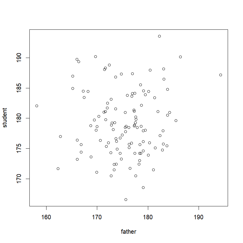
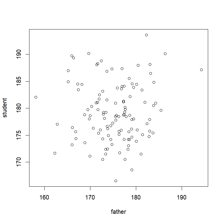
plot(father~student,col="blue")
points(mother~student,pch="+",col="red")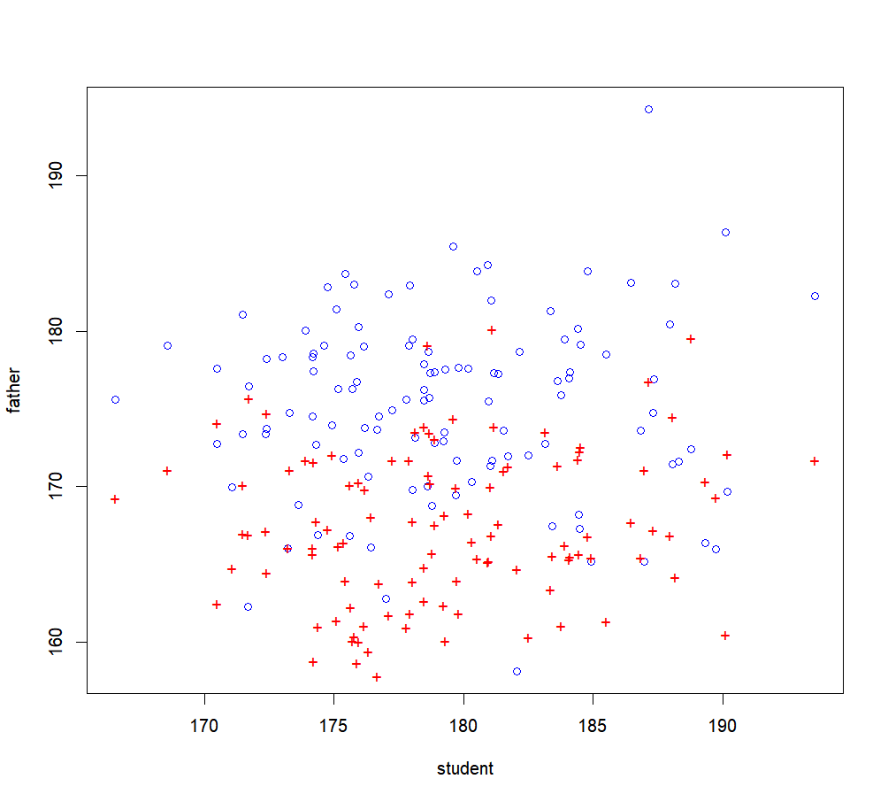
And on a side note, this can be used to trace a line that links your data points, when we set type=”l”
plot(x,y,type="n")   # Reminder: type="n" means "none", and doesn't display the points, exactly same syntax as with "plot()".
points(x,y,type="l")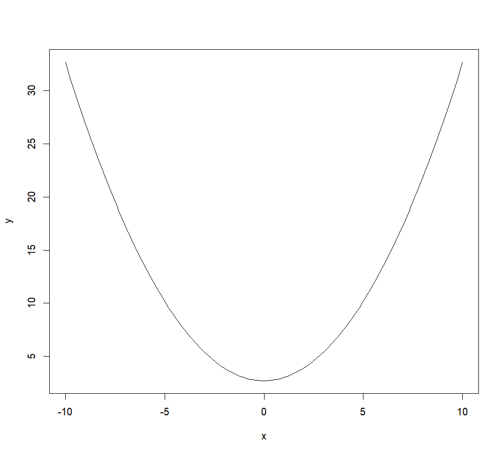
The function “abline()” will be useful when you need to add a straight line to a graph.
For a vertical line, you enter the x-value through the argument “v”. For a horizontal line, you enter the y-value through the argument “h”. In all other cases, you specify the intercept and the slope with the arguments “a” and “b” respectively.
plot(x,y-5,type="l")
abline(h=0,col="red")
abline(v=0,lwd=3)
abline(a=2,b=1,lty="dashed")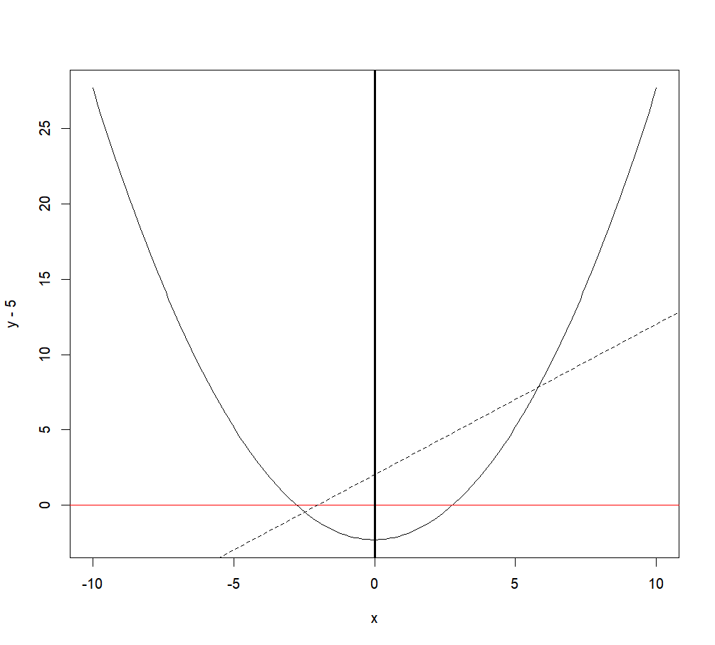
The “lines()” function allows you to add, guess what! Lines!
Its syntax is exactly like the one used for “plot()“.
plot(x,y,type="l")   # Reminder: type="n" means "none", and doesn't display the points, exactly same syntax as with "plot()".
lines(x,y+5,col="red",lwd=3)
And on a side note, this can be used to simply add other data points, when we set type=”p”
lines(x,y+10,type="p",col="blue") 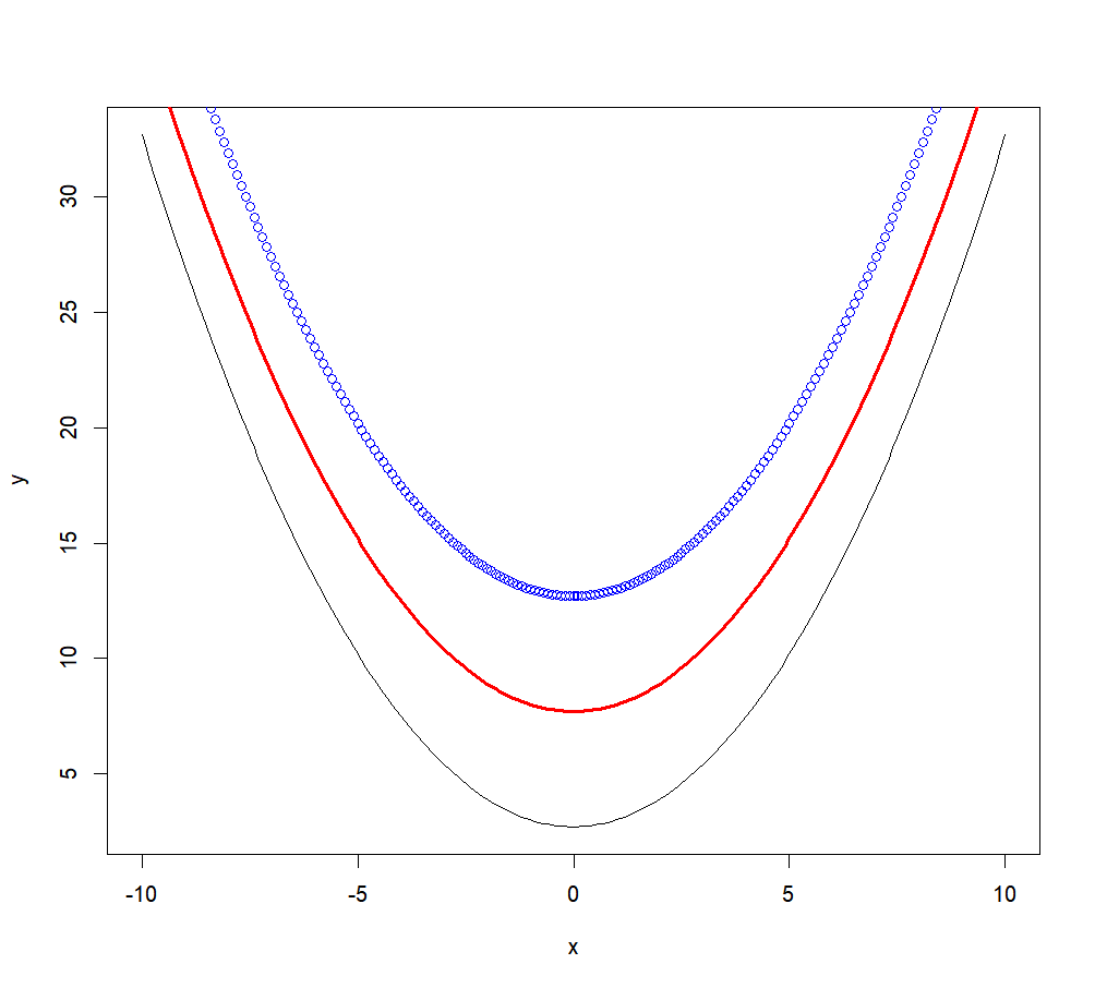
“Wait a minute Flo! The points() function can make lines, and the lines() function can make points? Isn’t it weird? Isn’t it redundant? Bottom line, what’s the point?”
Well, as far as I know, they are just to make things easy when you want to do one or the other, without having to worry about setting a type in a counter-intuitive way. There might be something else to it, but if yes, I don’t know what.
Adding text to a graph: the “text()” function
Feeling bold? You want to add information to your graph? R got what you want! You just need to bring 2 information with you: the text you want to add, and where you want to add it! Easy, right? Once that gathered, the “text()” function will do the rest of the work for you. As with most of graphical functions, it accepts basic arguments to suit your outcome to your mood! You can for example change the character expansion of the text, its color, or the font with arguments “cex”, “col” and “font” respectively.
See for yourself:
plot(x=c(-5,5),y=c(-5,5),type="n")  # plotting an empty plot
text(x=c(-3.5,0,3.5),y=c(4,0,-4),   # Entering x-y coordinates for 3 points
     labels=c("Dear Matlab","Freeware \n rocks","Sincerely, R"),  # text to add to the existing plot
     col=c("red","green","blue"),   # modifying text colors
     font=c(3,1,2),                 # modifying text fonts
cex=1.5) # modifying character size 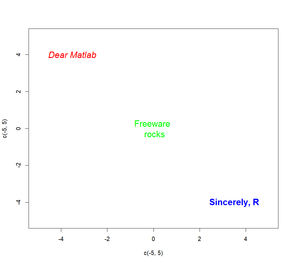
As you can see, it is possible to enter different pieces of text at the same time by using a vector of character strings as input for the “labels” argument. Consequently, colors and fonts for each piece of text can be specified with vectors containing information for each text element (vectors will be recycled as necessary if shorter than the labels’ vector). Here, our first piece of text will be red, the second green and the third blue. The font is specified with numbers, where 1 is for a normal font (the default), 2 for bold, 3 for italic, and 4 for bold and italic. Have you noticed the unexpected “\n” between “freeware” and “rocks” when we input the text information in the function? And more interestingly, have you noticed how it doesn’t appear in the graph? This combination of characters indicates to R that the text after “\n” should be printed on another line.
Interestingly, it is also possible to use the function “locator()” to specify the coordinates where the text should be plotted. More details about this function in the section Getting information from your graph. But here is an example:
text( locator(2),        # you will be able to click twice on the graph
      c("bla","rebla"))  # the two strings of character we want to add
This adds “bla” and “rebla” on two points you just clicked on in the graphical device.
I am “legend()”
What would a good graph be without a legend? A graph without a legend is an apple pie without apples, a Star Wars without lightsabers (or worst… with Jar-Jar Binks), an Indiana Jones without a whip, a baseball World Series without an American winner, a vector without a direction!… It doesn’t make sense.
Let’s make the legend true…
We will use the following histogram as a canvas for our legend.
hist(rnorm(100,0,1),col="grey",freq=F,xlab="x",
     xlim=c(-4,4),ylim=c(0,0.5))
The “xlim” and “ylim” allow us to set the range of our plot with vectors containing the lower and upper limits for the x- and y-axes respectively. For example, here, the x-axis is now forced to be represented over a range going from -4 to +4.
Plotting the Normal distribution:
lines(x,dnorm(x),col="red",lty="dashed")Adding random points:
points(rnorm(10,-3,0.5),rnorm(10,0.4,0.03),pch=19,col="blue")Let’s now add the legend, shall we? (more details about the meaning of each argument below)
legend("topright",               # location
       c("random points","density probability","Data"),  # elements of legend
       border=c(NA,NA,"black"),  # Color of the border of the boxes (here, only the 3rd element will have a box, bordered with black)
       fill=c(NA,NA,"grey"),     # Color of boxes (here, only the 3rd element will have a box filled with red)
       lty=c(NA,"dashed",NA),    # Line type (here, only the second element of the legend will have a line, dashed)
       pch=c(19,NA,NA),          # Point type (here, only the first element of the legend will have a point)
       col=c("blue","red",NA),   # Colors for the points and lines (the 1st element -the point- will be in blue, while the second element -the line- will be in green)
       bg="#FFFAF0",          # Background color
       bty="o",               # The box type for the whole legend
       pt.cex=1.5,            # Expansion factor for symbols
       cex=0.75,              # Whole legend expansion factor
       title="Legend")        # A title for the legend
The first argument (“topright”) corresponds to the location of the legend in the graph. This can be done in several ways. The simplest way is to explicitly write where we want the legend to be. The options available this way are “bottomright”, “bottom”, “bottomleft”, “left”, “topleft”, “top”, “topright”, “right” and “center”. It is also possible to do this by directly giving a vector containing the coordinates of the top-left corner of the rectangle containing the legend or with the function “locator()” (cf. next section).
The second argument is a vector containing the textual description of each item of the legend. Each element of this vector will correspond to one line in the resulting legend. Here, we have 3 items in our legend. We are providing a legend for the points, the line, and the bars of our histogram.
The third and fourth arguments will be used to plot a box in front of a specific item of our legend. “border” is used to specify the color of the border of the box, while “fill” is used for the inside of the box. For both arguments, we need to enter a vector containing as many elements as we have in the legend. This vector will contain the color for each item of our legend. A ‘NA’ will not print anything for the corresponding item. The first element of our vector will correspond to the first item of our legend, and so on. Here, our first item is represented by a grey box, and we are making sure that no box is plotted for our second and third items by setting the values to ‘NA’. If no box appears in the legend, those two arguments can be ignored.
The fifth argument “lty” is used to plot a short segment next a particular item. The values of the arguments can be the same as the one used in the functions “plot()” or “lines()” for examples. Similarly, an argument “lwd” can be used to modify the width of the line. As for the previous arguments, each element of the vector will correspond to an item of the legend, and a NA will not print anything for the corresponding element/item. Here, the second item of our legend is represented by a dashed line, and no lines are used for the 1st and 3rd items.
The argument “pch” can be used to plot a point character. As for its value, like the previous arguments, each element of the specified vector matches a particular item of our legend. Here, the first element is a filled circle (designated by the code ’19’, for more details on the “pch” values, you can see the help of the “points()” function).
The argument “col” will be useful when we need to set the color of each item of our legend that is illustrated by a point of a line. As seen above, the first element of our vector will describe the color of our first item. Here, our first element is blue (a blue point), and our second is red (a red dashed line). The third element is a NA because the filling color of a box is indicated through the argument “fill”. If no line or point appears in the legend, those last three arguments can be ignored.
It is possible to set the background color of our legend rectangle with the argument “bg“, and the type of box to draw around the legend with the option “bty“. Check the paragraph about the “bty” argument in the previous section about the “plot()” function for more information about the types of box available. Please note that is “bty” is set to “n”one, no background color can be selected.
Moreover, you can modify the expansion factor for the symbols and for the whole legend with the arguments “pt.cex” and “cex” respectively. You just need a scalar indicating the expansion ratio; a value of 0.75 for example will reduce the size to 75% of the default size.
Finally, you can give a title to your legend through the argument “title“.
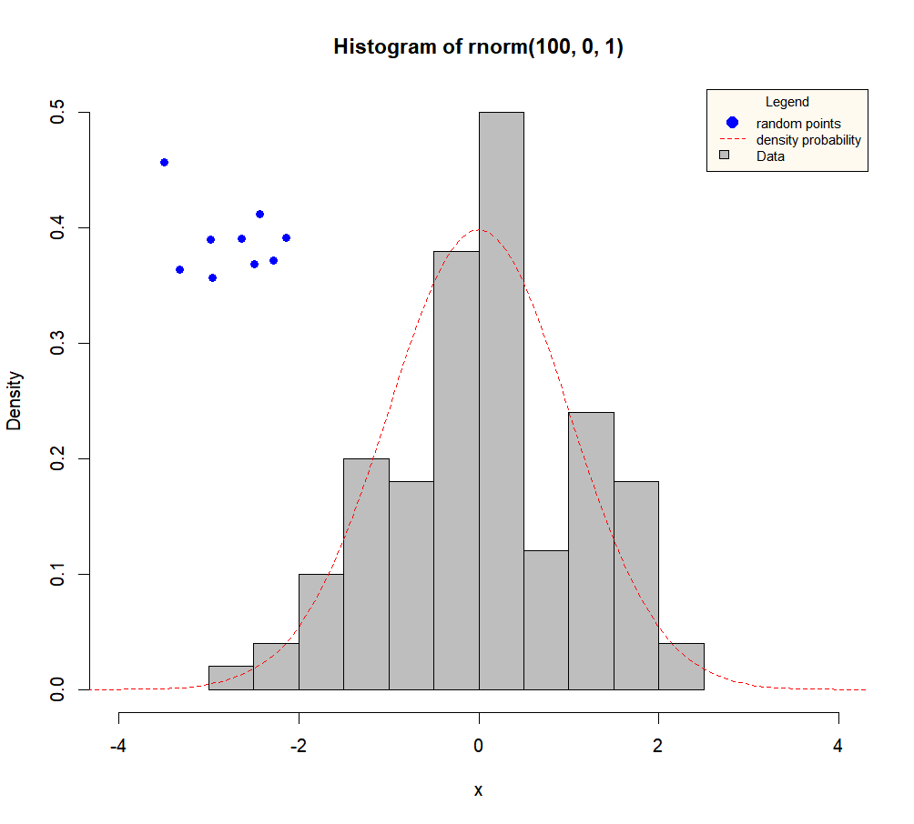
Here we go, you now have a beautiful graph that makes sense thanks to your legend…
MORE GRAPHICAL FUNCTIONS
Want a histogram? A boxplot? A barplot? You came to the right place!
THE “PLOT()” FUNCTION
A picture is worth a thousand words. Here is how to make a graph worth twice that.
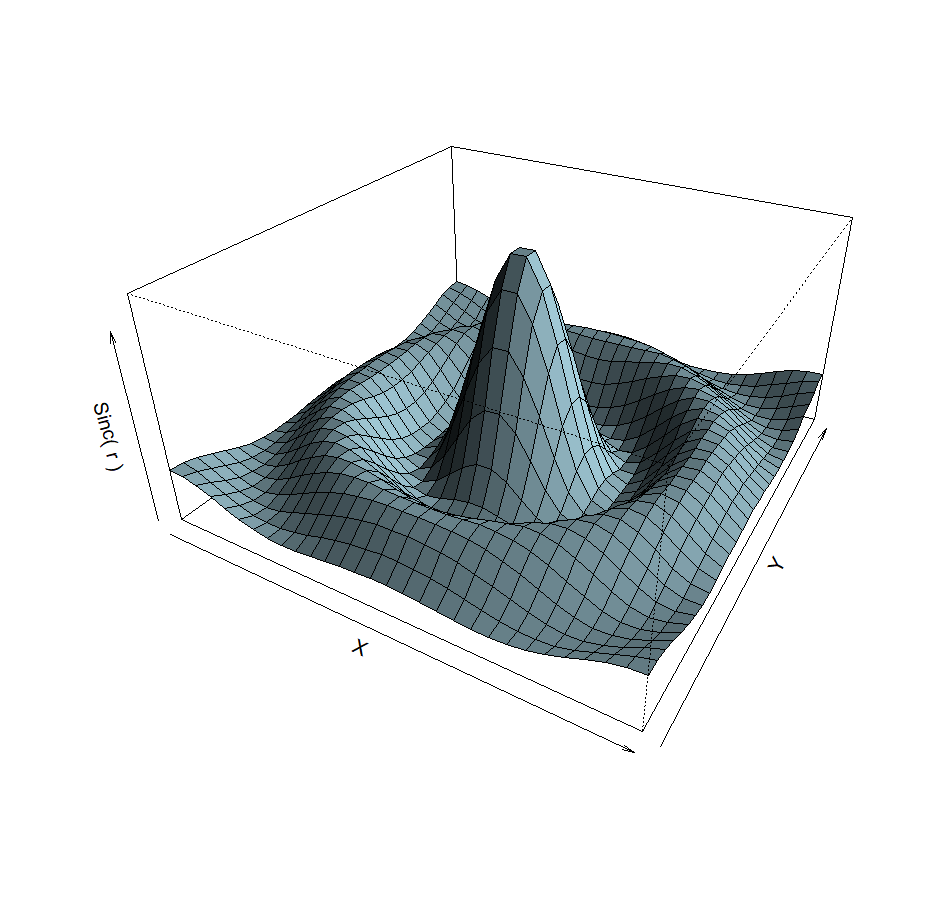
A LITTLE BIT OF 3D?
2D is so 1990. 3D is the future.
GETTING INFORMATION
Or how to interact with your graph!