A quick look at our data
Before doing any analysis, it is important to look at our data and do some exploratory graphs to help us identify patterns and potential problems in our data.
The function “stripchart()”: to take a look at your individual data points
By default, this function will show you horizontally each data point (but this can be changed by setting the option “vertical” to “True”). If you have several categories in your dataset, they will be shown next to each other on the same graph. In order to be able to see each point, even points with same values, we can set the option “method” to the value “jitter”. This will ensure that points with identical values are shown with a slight shift.
For example, let’s create a dataset, where we will compare size of students in relationship to the size of their parents. The function “rnorm()” will allow us to take ‘n’ samples (in our case, n=115) in a Normal distribution with a specified mean and standard deviation.
student=rnorm(115,mean=179,sd=5)
father=rnorm(115,mean=175,sd=6)
mother=rnorm(115,mean=166,sd=6)
Let’s take a look at the distribution of our three clouds of data points:
stripchart(list(student,father,mother),
           group.names=c("student","father","mother"),
           method="jitter", vertical=T)
The option “group.names” is used to specify the name of each group so it appears nice and pretty on the graph.
We can see here that students seem to be on average taller than their dads, who are themselves taller than the mothers. (Which is by the way not surprising, since this is how we specified it when creating the dataset.) This would need to be tested through a statistical analysis, but this exploratory graph already allows us to take a look at our data, and would permit us to detect unreasonable outliers. Moreover, it forces us to take a look at our individual dataset, and therefore to never forget their intrinsic variability.
By the way, when dealing with a lot of data, it is useful to use “open” symbols for each point. As close data are stacking over each other, the background darkens, giving us a nice representation of the density of individuals depending on the area of the graph. This gives you a first look at the statistical notion of probability density.
The function “hist()”: instantaneously make an histogram of your data distribution
In Excel, making a histogram is a pain in the neck, to say the least. You would have first to set your interval values, sort your data, count how many individuals you have in each class, click over and over again to obtain a correct graph. And once all of that is done, you end up realizing that the interval you set are not pretty enough, so you have to do it all over again… Pain in the neck indeed!
And now, let’s see how R does this.
3…
2…
1…
hist(student)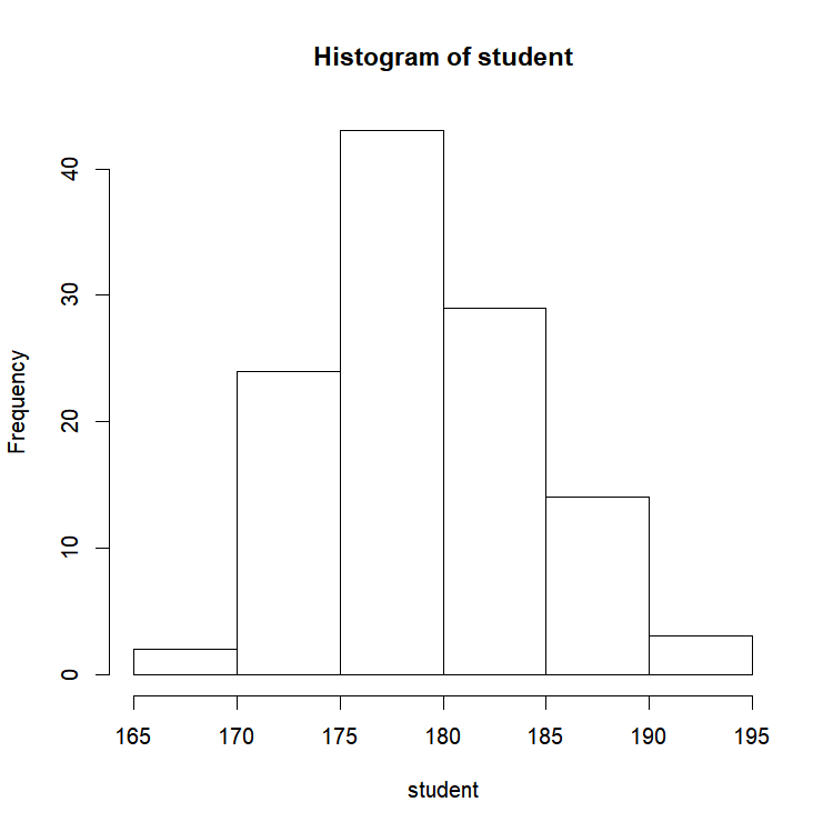
Seriously, is it possible to make simpler than that? R automatically picked the class intervals. However, if you ever need to change those, easy peasy! How many breaks do you want?
hist(student,breaks=20)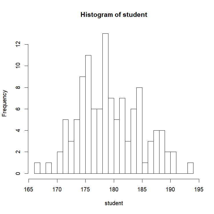
Almost magical! Life is so much easier when you have tools like that at hand’s reach!
And if you want to add a 1-dimensional representation of the data to the plot, the poetically named function “rug()” is there for you:
rug(student)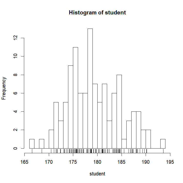
The function “plot()”: take a look at your data points in relation to each other
Two different ways to produce a “Y = f(X)” graph.
plot(X,Y)
plot(Y~X)
The tilde sign meaning “as a function of”. For example, let’s look at the size of students in function of their fathers’ size!
plot(student~father)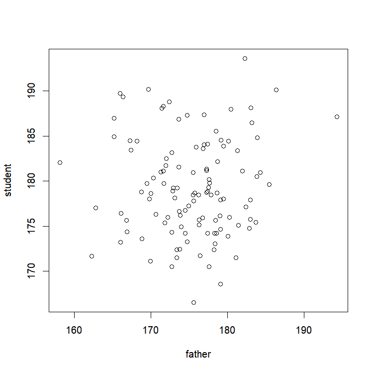
We can now easily modify this graph to see for example if our data points are harmoniously spread around the 1:1 line going through 0 (indicating that kids and parents are on average the same size):
abline(0,1, col="blue") # Tracing a blue line with an intercept equal to 0, and with a slope equal to 1
Let’s also add a red target showing the center of gravity of our data cloud, by tracing 2 lines (one going through the mean size of students, and the other by the fathers’).
abline(h=mean(student), col="red") # Tracing a horizontal line with an intercept equal to the average student size 
abline(v=mean(father), col="red") # Tracing a vertical line with a x-value equal to the average size of the fathers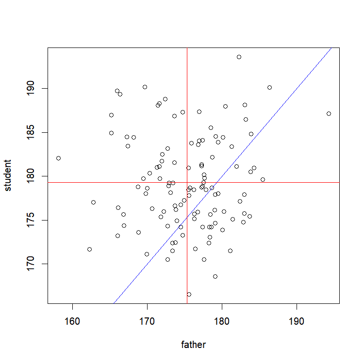
Isn’t it amazing how simple it is to do that? We can see here that on average, our students are taller than their fathers. We would still have to perform a statistical test to be sure of that, but we already kind of know where we would be going with that!
Exercise 2.4– Plot the values in the column ‘forlater’ of ‘ex.data’ against the values of the column ‘vecA’ – Add to the existing graph a red line with a slope of 3 and an intercept equal to the mean of ‘vecB’
|