Fancy a little bit of 3D?
I would like to really quickly show you 2 nice ways of making beautiful 3D plots before concluding this “course”.
The “scatter3d()” function
The package “car” offers a beautiful and easy way to plot data points (a response variable) in function of two variables.
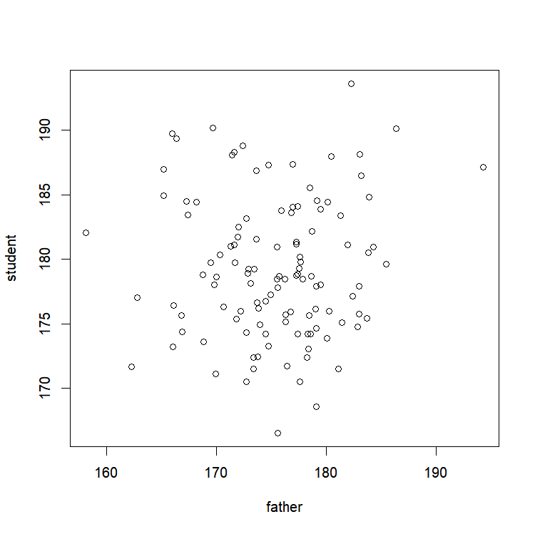
Let’s take some data to see how it looks like. For example, the number of times my dog barks in the day. I assume it to be positively correlated with the number of cars that pass by our street, and probably negatively correlated with the amount of food I give her (in kilograms! Yeah, in grams, suck it again imperial system!). So, I was crazy enough to record that information over the course of 3 weeks, and it gave me something like this:
Cars= c(32, 28, 9, 41, 23, 26, 26, 31, 12, 25, 32, 13, 19, 19, 38,
        36, 43, 26, 21, 15, 17, 12, 7, 41, 38, 33, 31, 9, 40, 21)
Food= c(0.328, 0.213, 0.344, 0.339, 0.440, 0.335, 0.167, 0.440, 0.328,
        0.100, 0.381, 0.175, 0.238, 0.360, 0.146, 0.430, 0.446, 0.345,
        0.199, 0.301, 0.417, 0.409, 0.142, 0.301, 0.305, 0.230, 0.118,
        0.272, 0.098, 0.415)
Bark=c(15, 14, 6, 12, 8, 1, 9, 8, 1, 12, 14, 9, 8, 1, 19, 8, 13, 9,
       15, 11, 8, 7, 8, 16, 15, 10, 15, 4, 17, 0)
Quick look at our raw data
x11()
par(mfrow=c(1,2))
plot(Cars,Bark)
plot(Food,Bark)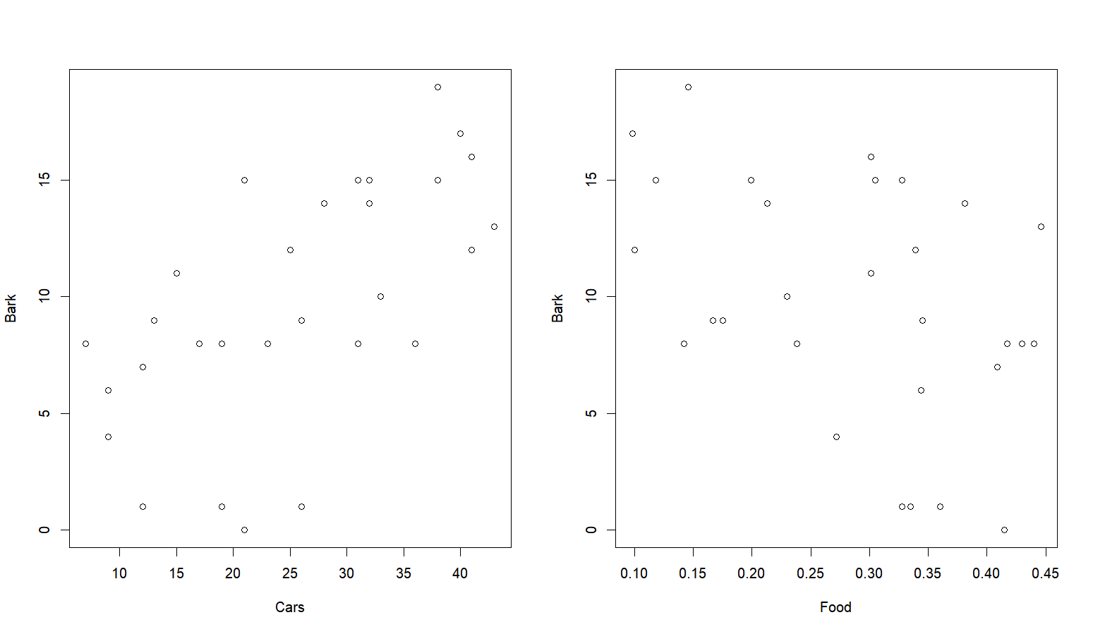
Now in 3D!
library(car)
scatter3d(Bark~Food+Cars,surface=FALSE)
Setting the argument “surface” to TRUE will on top of that add a regression surface to the mix!
scatter3d(Bark~Food+Cars,surface=T)… Wow…. That’s beautiful…. Don’t you think? Go ahead, try to move it with your mouse (hint: use left click)… I’ll wait here…
Are you back? Yep, beautiful, isn’t it?
Look back at it, grab your mouse, try to move it again, while right-clicking!
Impressive, isn’t it?
I almost cried when I look at it the first time.
The “persp()” function
This function draws perspective plot of a surface. Let’s take the example that is already included in R, because, for once, it’s pretty cool (and also because I’m running out of ideas for fake datasets)! First we need to create a set of x-y coordinates:
x <- seq(-10, 10, length= 30)   # Creating a vector of equally spaced
                                # values between -10 and 10
y <- x                          # Same vector for the y-coordinates
# Creating a function to combine x and y in a response variable z
# (we'll see in the next class how to create functions)
f <- function(x,y)
       {r<-sqrt(x^2+y^2); 10*sin(r)/r}

z <- outer(x, y, f)     # Creating an array x*y where each cell
                        # value is the result of the previous function
z[is.na(z)] <- 1        # Taking care of NAs
Now for the fun part!
We now just need to plug those coordinates in the “persp()” function:
persp(x,y,z)
A little raw, but it’s already nice. First, let’s put some color. What about a nice light blue? “col=”
persp(x, y, z, col = "lightblue") 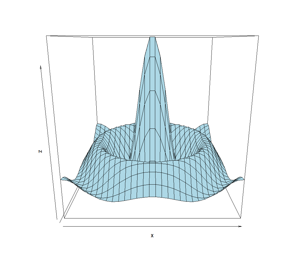
Ok, better. The angle could be improved. What about looking at it from slighty higher: “phi=”
persp(x, y, z, phi = 30, col = "lightblue") 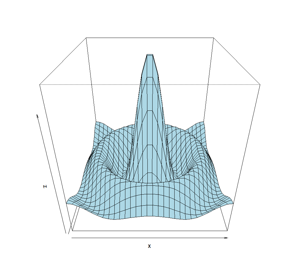
Let’s also rotate it a little bit: “theta=”
persp(x, y, z, theta = 30, phi = 30, col = "lightblue") 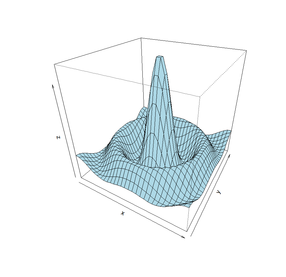
And to make it look ultra-cool, shading: “shade=”
persp(x, y, z,
      theta = 30, phi = 30,
      col = "lightblue", shade = 0.75)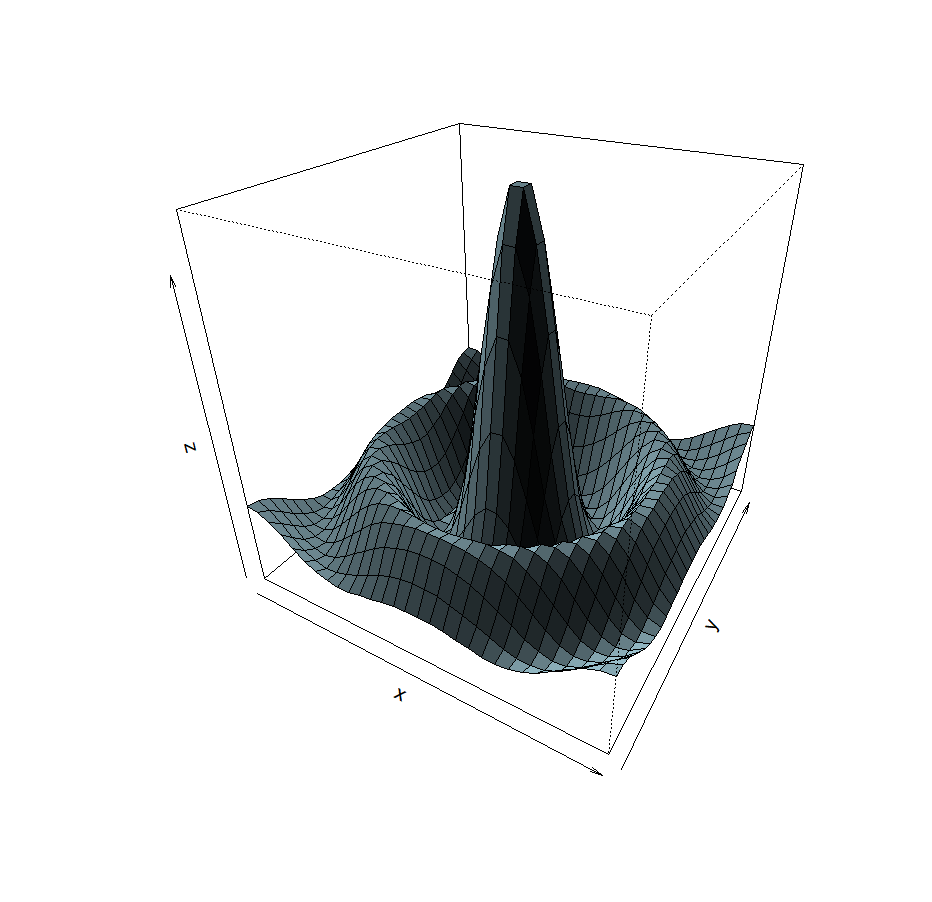
Eww… Too dark! Let’s move the light source up: “ltheta=”
persp(x, y, z,
      theta = 30, phi = 30,
col = "lightblue", ltheta = 120, shade = 0.75) 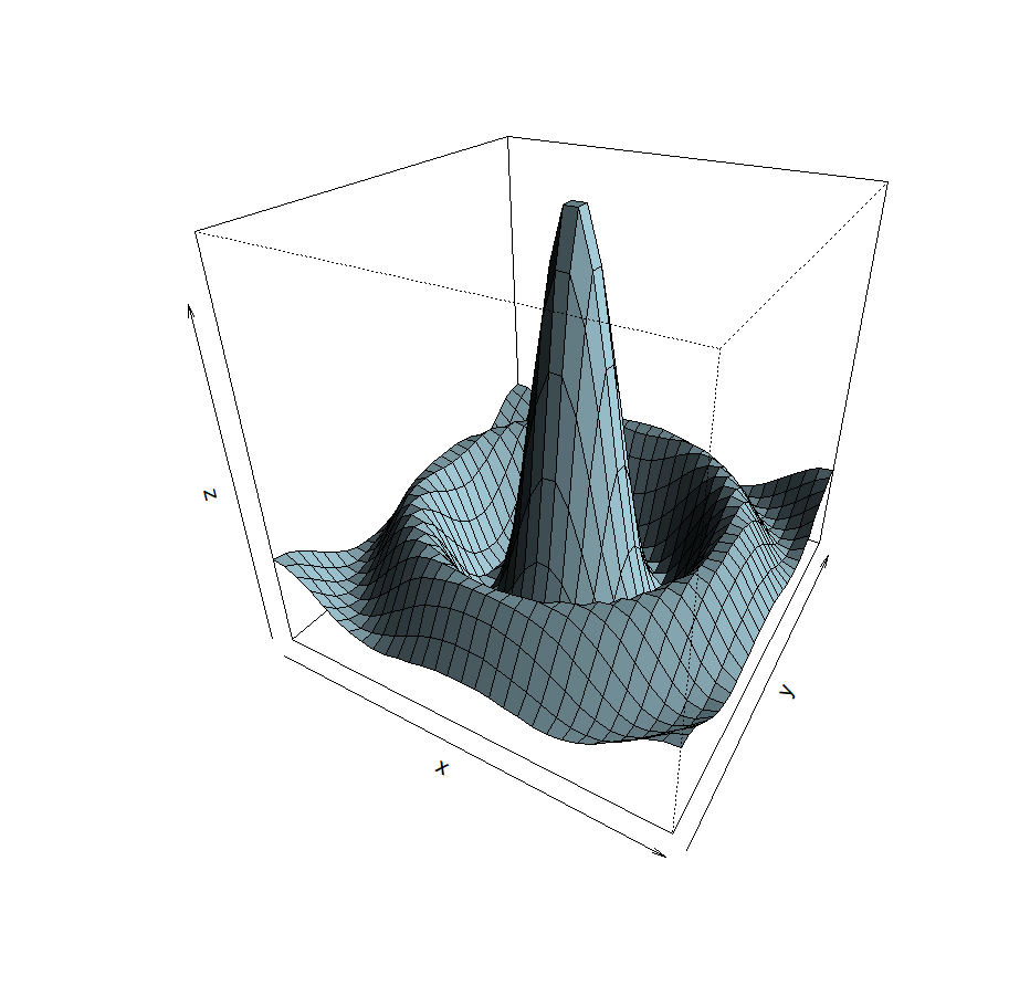
Side note: as you might have realized by now, the jumps are just there to make things easier to read. As long as the current instruction/function is not closed, R will wait for it, even if a jump is done.
Better. Let’s shrink the z coordinates representation. The argument “expand” permits to expand the z-scale by the specified ratio. A ratio under 1 will therefore shrink it. “expand=“
persp(x, y, z, theta = 30, phi = 30, col = "lightblue",
      ltheta = 120, shade = 0.75,
expand = 0.5 ) 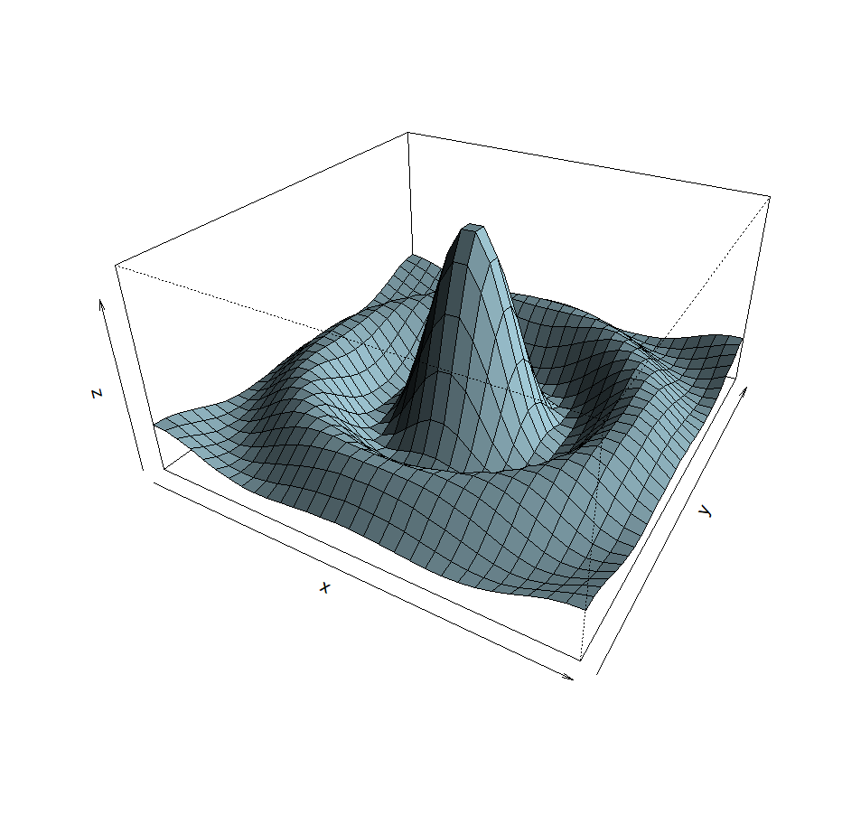
Much better! And finally, because why the hell not, axes’ labels!!!
persp(x, y, z, theta = 30, phi = 30, col = "lightblue",
      ltheta = 120, shade = 0.75,
      expand = 0.5,
xlab = "X", ylab = "Y", zlab = "Sinc( r )" ) 
Phew, that was not as easy as we would have all probably wished, but, hey, the result is worth it!
Now, you know how to make beautiful plots! While it might look like a lot at first, once mastered, the possibilities are fantastic, and definitely worth it.
Ok, thanks, and see you next week!
What? Oh, I forgot to let you know how to save your beautiful graphs? Oops! Let’s quickly go over it then
GETTING INFORMATION
Or how to interact with your graph!
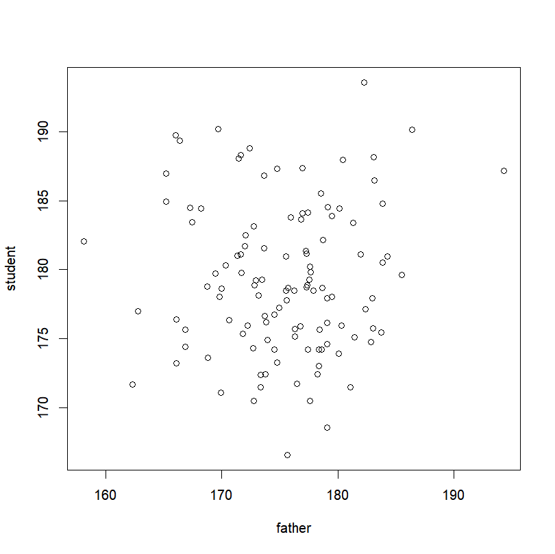
THE “PLOT()” FUNCTION
A picture is worth a thousand words. Here is how to make a graph worth twice that.
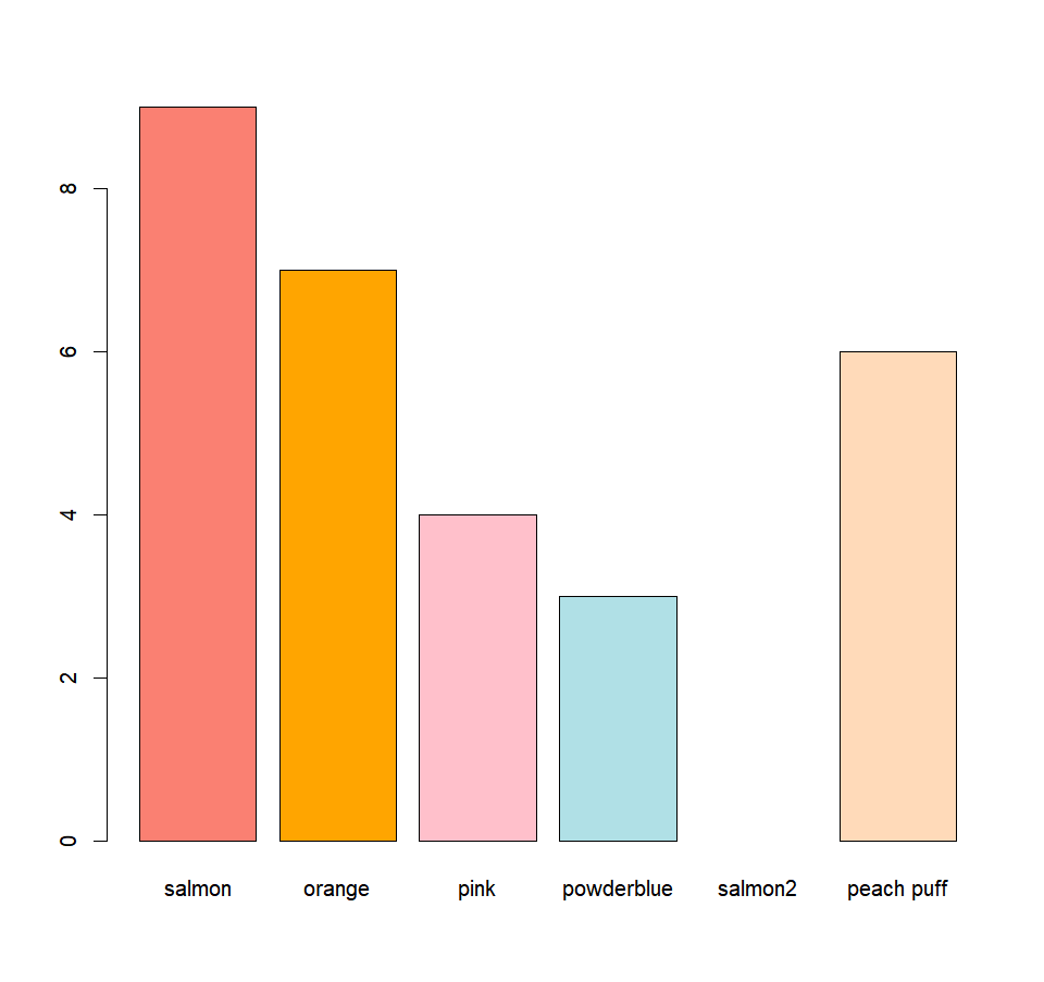
MORE GRAPHICAL FUNCTIONS
Want a histogram? A boxplot? A barplot? You came to the right place!
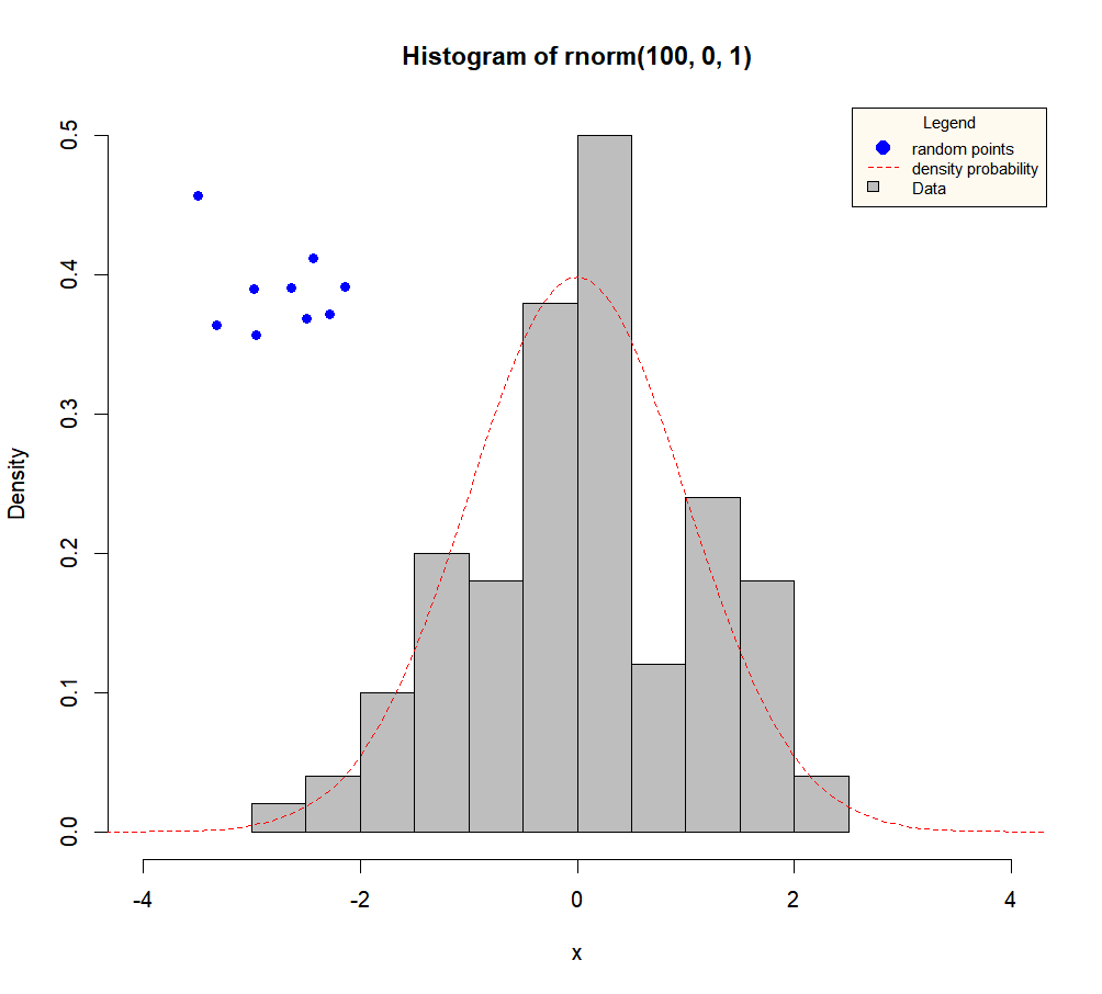
ADDING ELEMENTS
A look at putting finishing touches to your masterpiece.