More graphical functions
We have seen several functions and arguments that allow us to come up with beautiful graphs, and modify them as needed. R is loaded with many more functions that can be used for particular purposes (as you have seen with “demo(graphics)”. We’ll see some of them below. This section doesn’t have the pretension to present an exhaustive and detailed review of what is available, but hopefully will show you some useful and “cool” ones.
The “hist()” function.
We have already seen how to make a nice looking histogram to illustrate the frequency at which each data value or range of values appears in our data. But, let’s look at it again. We have a vector containing numerical values. For example, 100 random samples of a normal distribution (with mean 0 and standard deviation of 1):
randomsample=rnorm(100,0,1)To get a histogram from that, simply use the “hist()” function!
hist(randomsample)And if needed, we can change the way the ranges are defined, by changing the number of breaks:
hist(randomsample,breaks=20)Or by specifying the breakaway points in a vector:
breakvalues= c(min(randomsample),
               -2 , -1 , 0 , 1 , 2 ,
               max(randomsample))
hist(randomsample, breaks=breakvalues)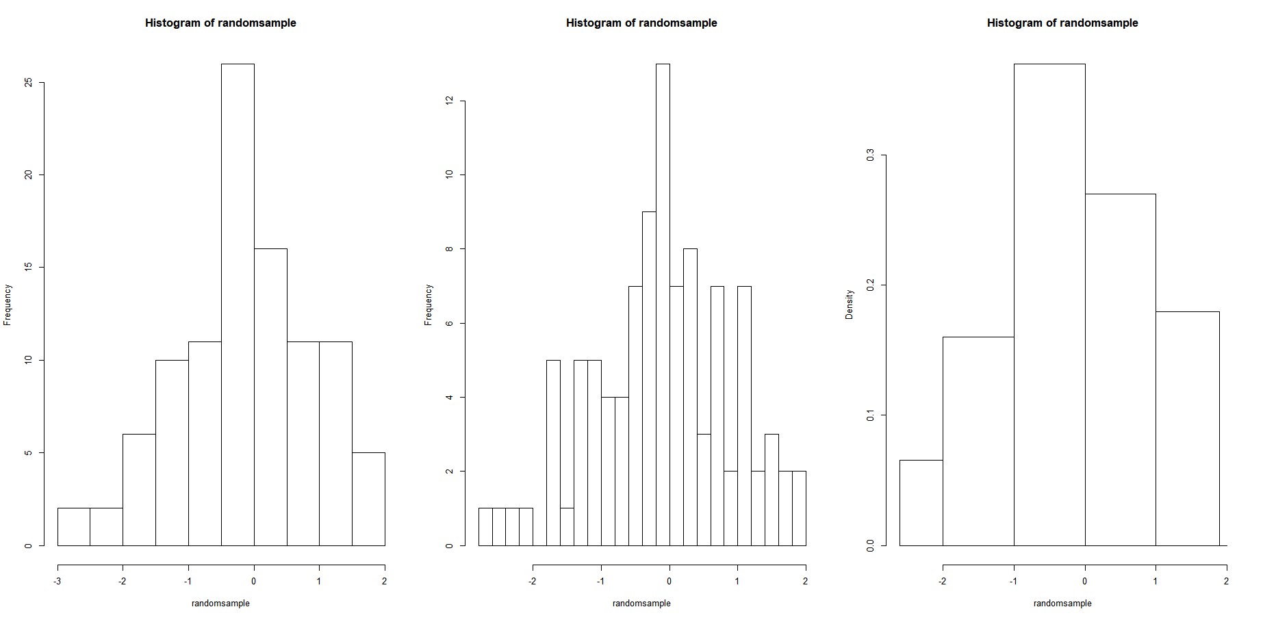
Want to add some color? You can specify the colors of each bar globally with the argument “col” (you should have gotten use to this argument by now):
hist(randomsample,col="red")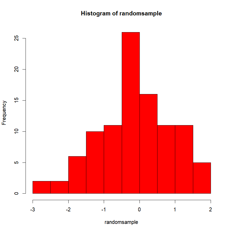
Or one by one, with a vector. First color in your vector will go for the first bar on the left. The second color for the second bar, and so on. If the vector is too short for the number of bars you have, its values are going to be “recycled”. It simply means that once you have gone through all the colors in your vector, to fill in the remaining bars, R starts reading the colors back at the beginning of the vector:
hist(randomsample,col=c("blue","white","red"), main="France")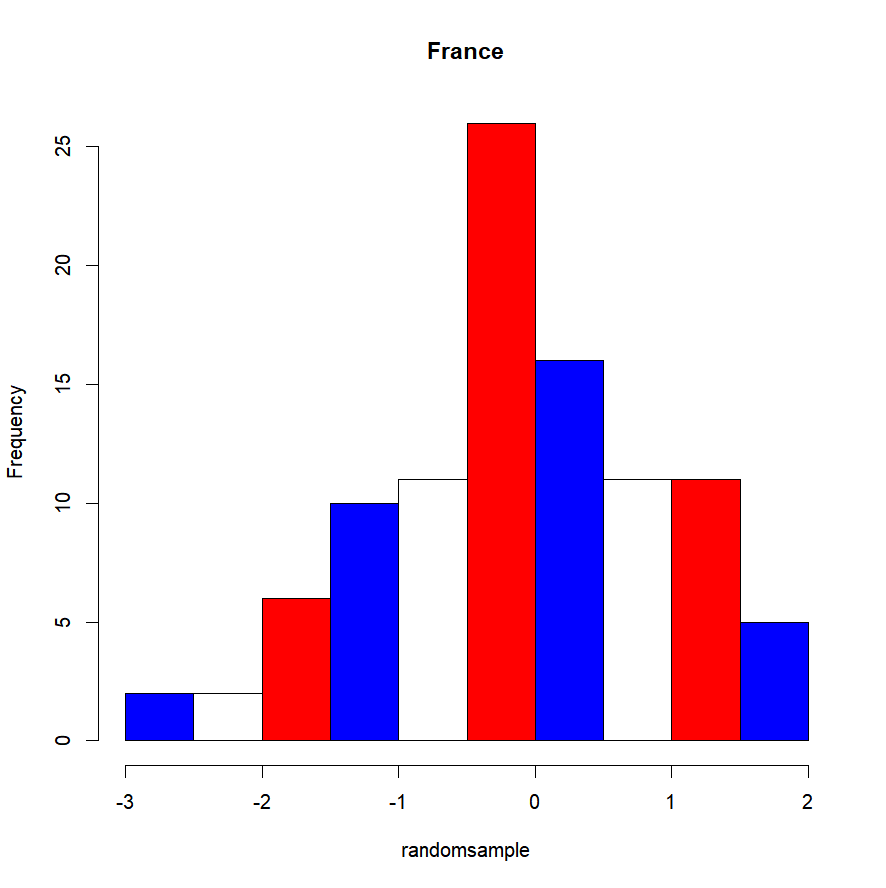
The y-axis scale can be modified by specifying whether we want it to display the counts (i.e. frequency) or the probability density, with by setting the argument “freq” to T or F respectively. The graph shape will not change, but the scale at which it is displayed will, which will become handy for example if we want to add further elements to our plot.
hist(randomsample,freq=T)   # The reading on the y-axis will correspond to
                            # the number of counts we have in our data that
                            # match the range class read on the x-axis.
hist(randomsample,freq=F)   # The reading on the y-axis will correspond to
 # a probability for the range class read on the x-axis.
 # This way, the area covered by our bars sums up to 1.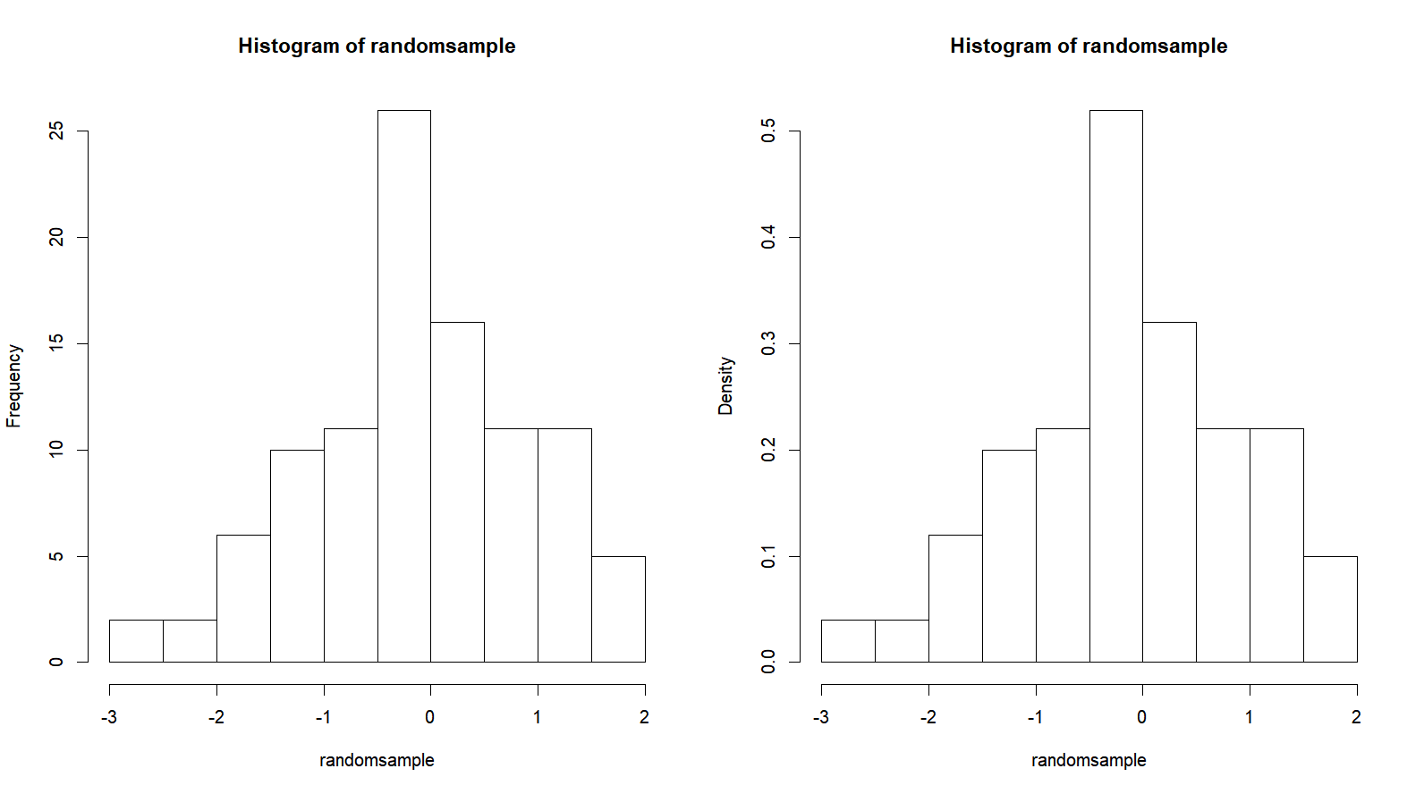
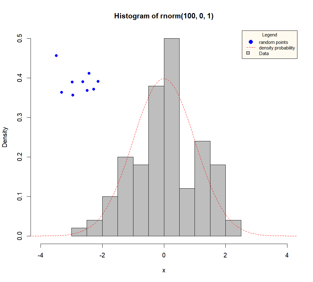
The “density()” function
The “density()” function is used to compute the kernel density estimates. While not technically a plotting function, it can be used to draw the probability density of our data. We just need to feed it our data, and then feed what is returned by the function to our plotting function. Either in a separate graph:
d=density(randomsample)
plot(d)
Or on an existing graph:
hist(randomsample,freq=F)
lines(d,col="red")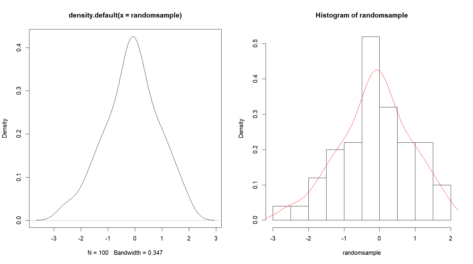
The “boxplot()” function
You just got your data, and are curious about what is happening in them? Need to take a quick first look? Boxplots (also called box-and-whisker plots) are perfect for that. On the same graph, you’ll have convenient representation of your data’s quartiles. Your data could simply be a vector:
boxplot(randomsample)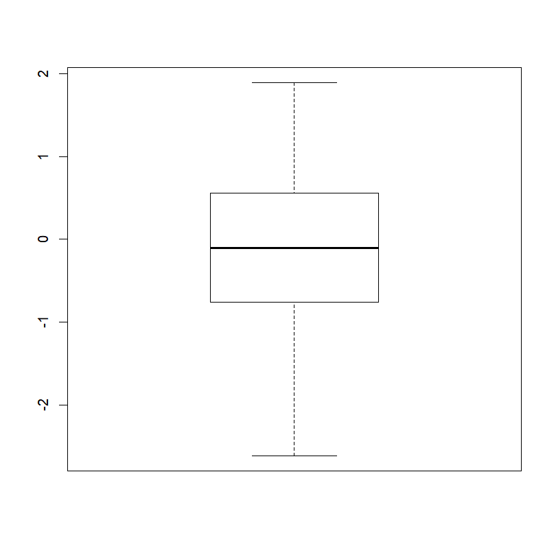
A data frame where each column corresponds to a group/factor
boxplot(size)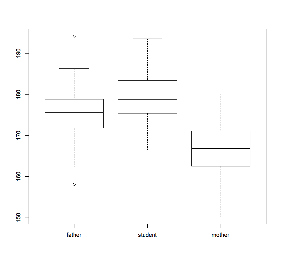
Or a table where one column will contain the recorded values of interests, and the other column the factor defining the groups. In this case, use the formula formulation.
boxplot(rating~actor,data=film)
Box and whisker plots‘ presentation is standard. The bottom and top of the box are always the first and third quartiles, and the dark band inside the box is the median (second quartile). By default, to simplify, the whiskers will help you to identify outliers. Each outlier is plotted as a point outside of the range of the whiskers. Moreover, this function can give you great insights about the existence of a difference between your population if you set the argument “notch” to TRUE.
boxplot(size , notch = T)If the notches of two plots do not overlap this is ‘strong evidence’ that the two medians differ.
… And of course, colors. Same things as with “hist()“:
boxplot(size , notch = T , col=c("blue","purple","pink"))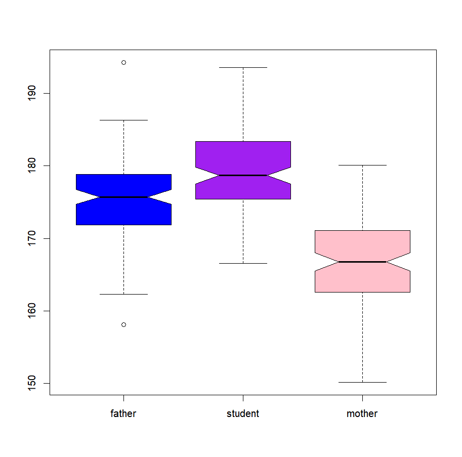
The “barplot()” function
The bar plot creates a plot with vertical or horizontal bars. You don’t say… Remember our shirts?
barplot(shirts$perfectness)We can label each column with the argument “names”
barplot(shirts$perfectness,names=shirts$hue)And as previously shown, even set the color of each column, with “col”
barplot(shirts$perfectness,
        names=shirts$hue,
        col=as.character(shirts$hue))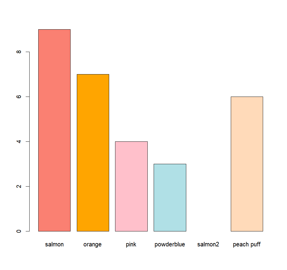
And if you prefer your bars horizontal, you just have to ask (by setting the argument “horiz” to TRUE:
barplot(shirts$perfectness,
        names=shirts$hue,
        col=as.character(shirts$hue),
        horiz=T)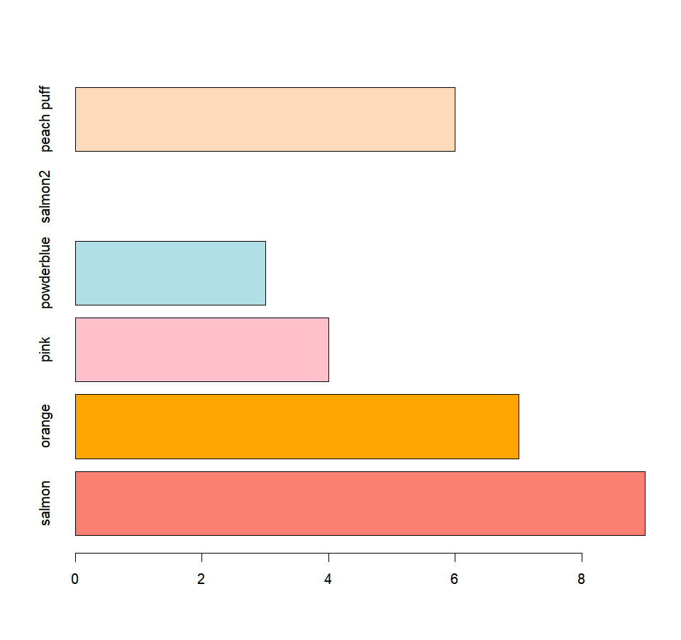
You might want to compare two groups over different factors, over different years, with a barplot. You can represent two groups side by side for each factor or year by setting the argument to ‘beside’ to TRUE. With a data frame as input, each column will correspond to one factor/year, and each row to one of the groups. As a bonus, you can also include a legend with the argument ‘legend’. You just need to specify the name of each category in a vector.
VG <- matrix(c(6,5,7,8,1,2),nrow=2)
colnames(VG)=c("princess saved","castle destroyed","Controller #")
rownames(VG)=c("mario","luigi")
barplot(VG, main="Mario vs Luigi",
        col=c("red","green"),
        legend = rownames(VG), beside=TRUE)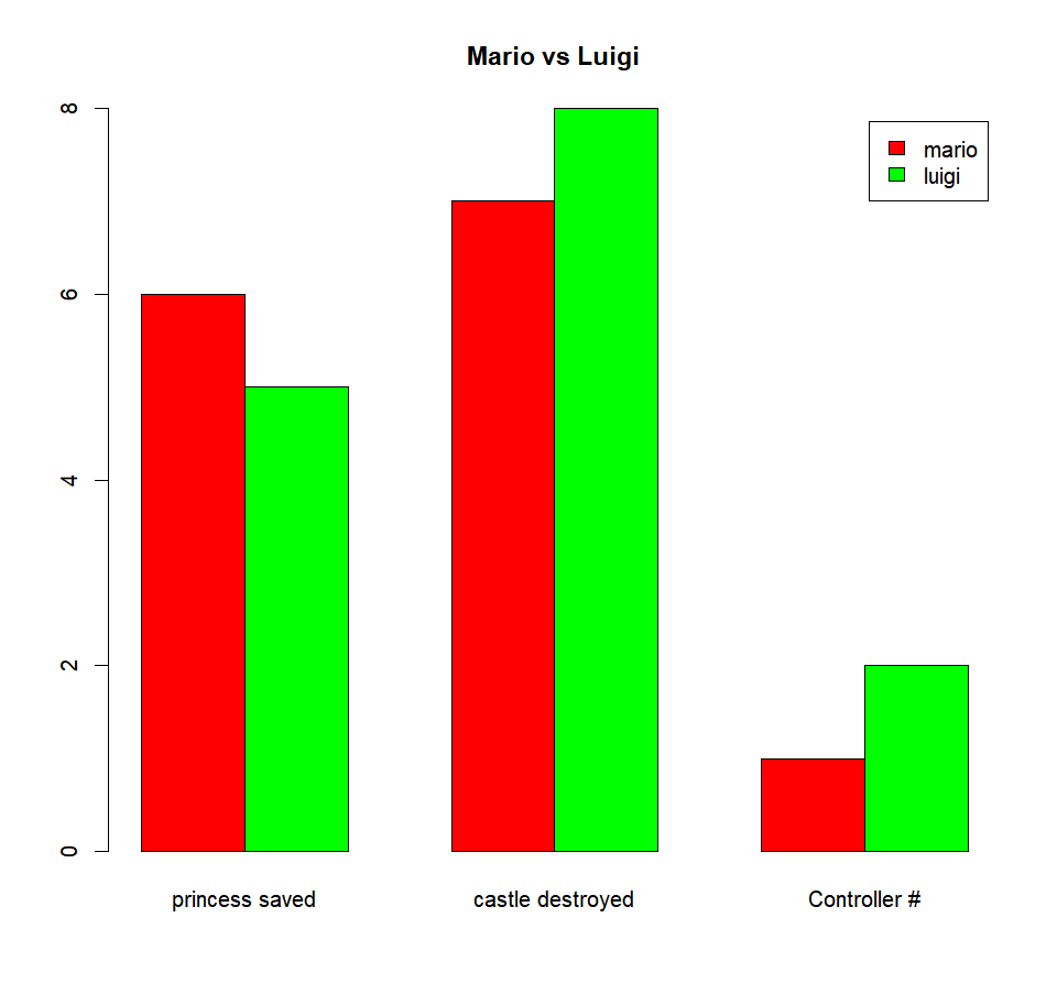
|
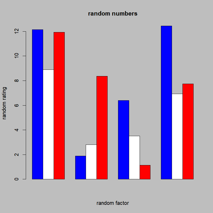
Exercise 4.2– Create a matrix ‘randmat’ containing 4 columns and 3 rows with random values between 1 and 15 (either manually or with function “runif(12,1,15)”) – Set the background of the next graph to grey – Make a barplot where 1st group is colored in blue, the 2nd in white, and the 3rd in red. Groups should be presented side by side. – Using argument in the barplot function, add a main title and a title for each axis.
|
The “plotmeans()” function
One last “regular” function that I will present is the “plotmeans()” function. Remember how I told you that if it doesn’t exist in R, you can create it? That’s exactly what happened with this function. R was missing a convenient function that would represent automatically the mean and the confidence intervals for some data. Sure, it was possible to do it in several steps, by computing the mean, plotting it, computing the confidence intervals and adding them to the graph. But, this is cumbersome. So, let’s use a function that does all of that for us.
First, we need to load the package containing this function: “gplots”. (after possibly downloading it if you don’t already have it. If you forgot how to, refer to the section “Playing with your data“).
library(gplots)And then, using the formula formulation:
plotmeans(rating~actor,data=film)If you don’t like the different group to be connected to each other by a line, set “connect” to FALSE:
plotmeans(rating~actor,data=film,connect=F)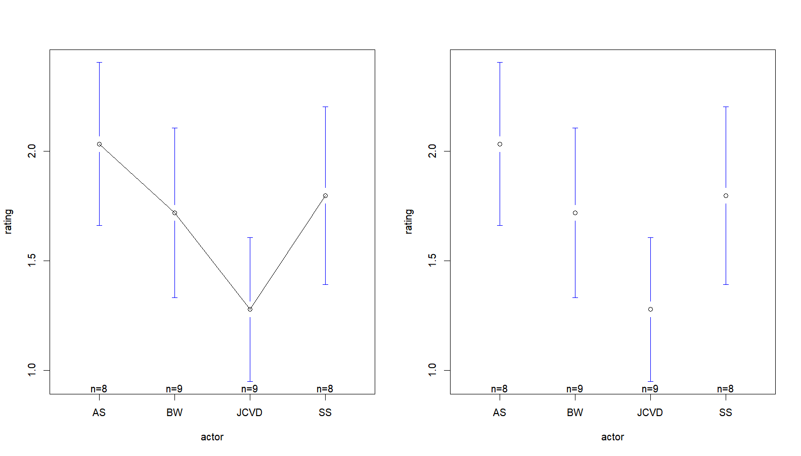
A quick reminder:
– if two samples don’t have overlapping 95% confidence intervals, statistical tests should indicate that they are significantly different
– if two samples have overlapping 95% confidence intervals and at least one mean is overlapped by the other sample’s confidence interval, statistical tests will more than likely indicate that they are not significantly different
– if two samples have overlapping 95% confidence intervals and the means are not overlapped by each other’s confidence interval, statistical tests will be needed to say anything about the difference (or absence of) between the two groups.
GETTING INFORMATION
Or how to interact with your graph!
THE “PLOT()” FUNCTION
A picture is worth a thousand words. Here is how to make a graph worth twice that.
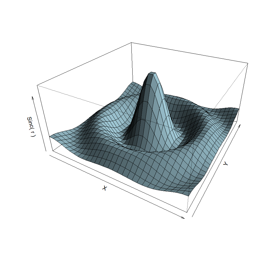
A LITTLE BIT OF 3D?
2D is so 1990. 3D is the future.
ADDING ELEMENTS
A look at putting finishing touches to your masterpiece.